oh.lala... identity
naming and logo
In Osaka and Japan in general, we noticed that there are a lot of shops and restaurants to be found that have a French inspired name or theme, which as European outsiders amazed and amused us. So for the all day dining restaurant of W Osaka we came up with the idea to make a French inspired brasserie. We gave it a quirky French name: 'Oh.lala...'.
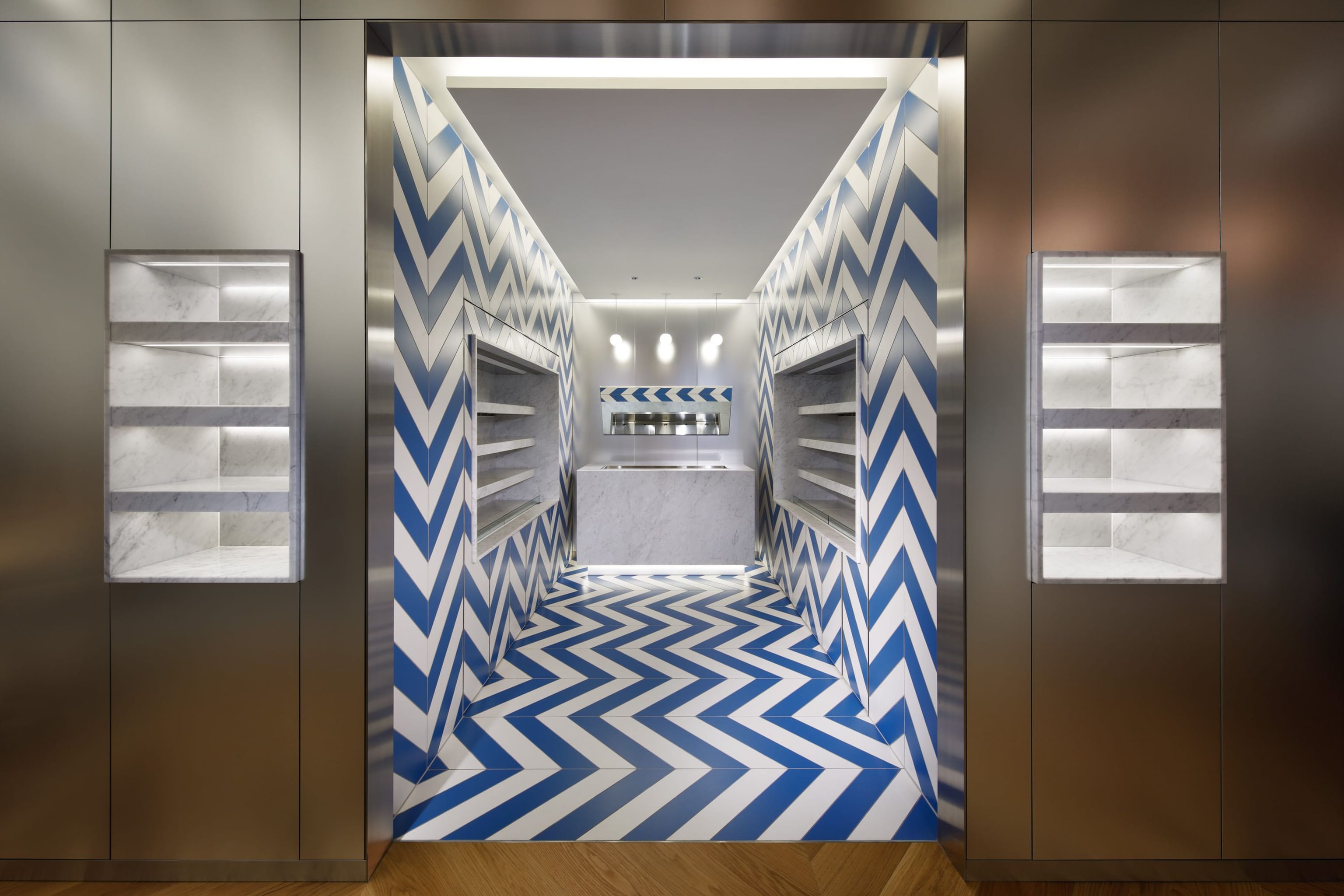
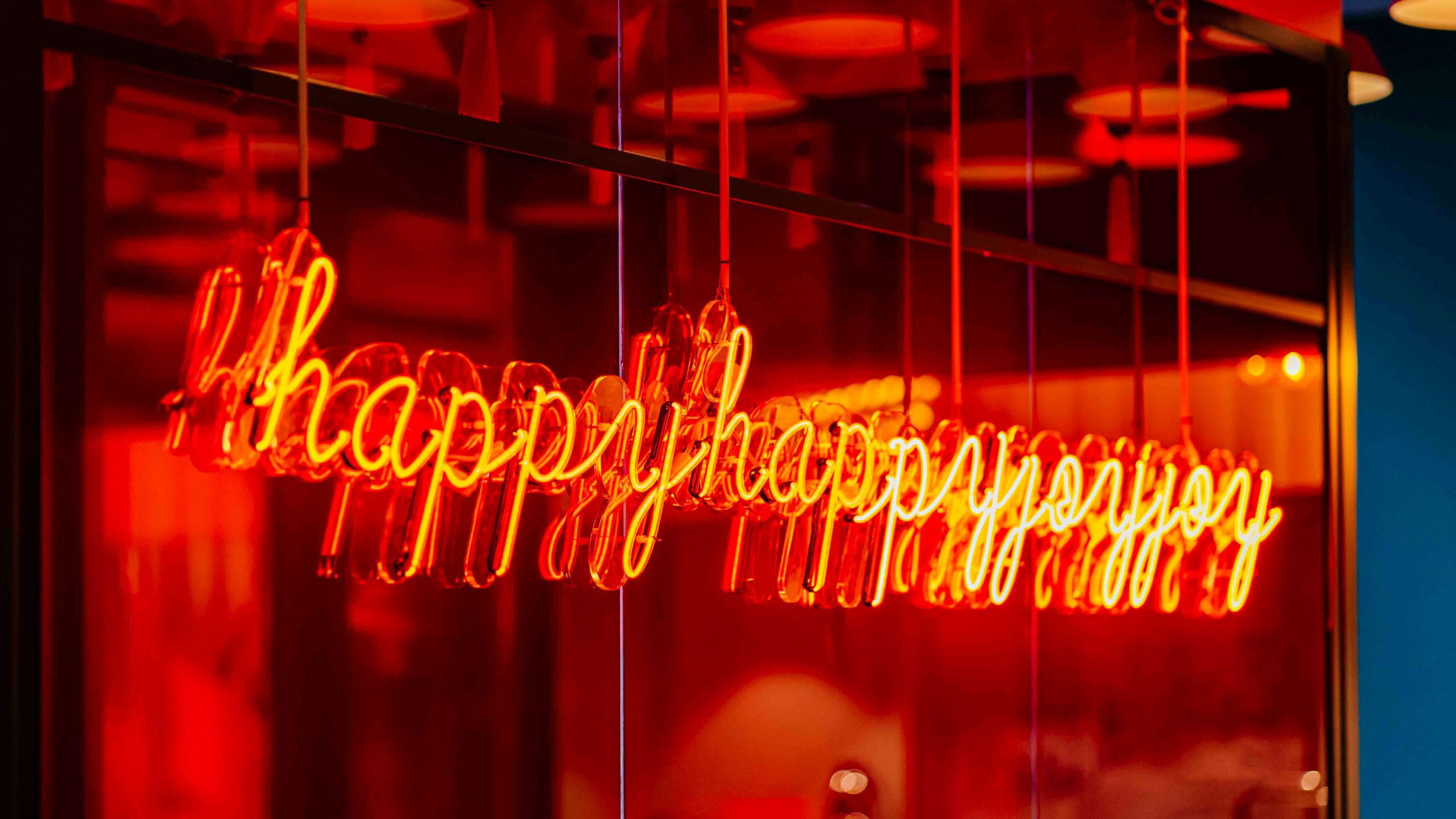
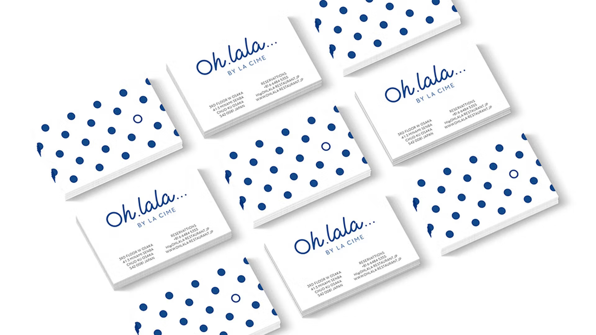
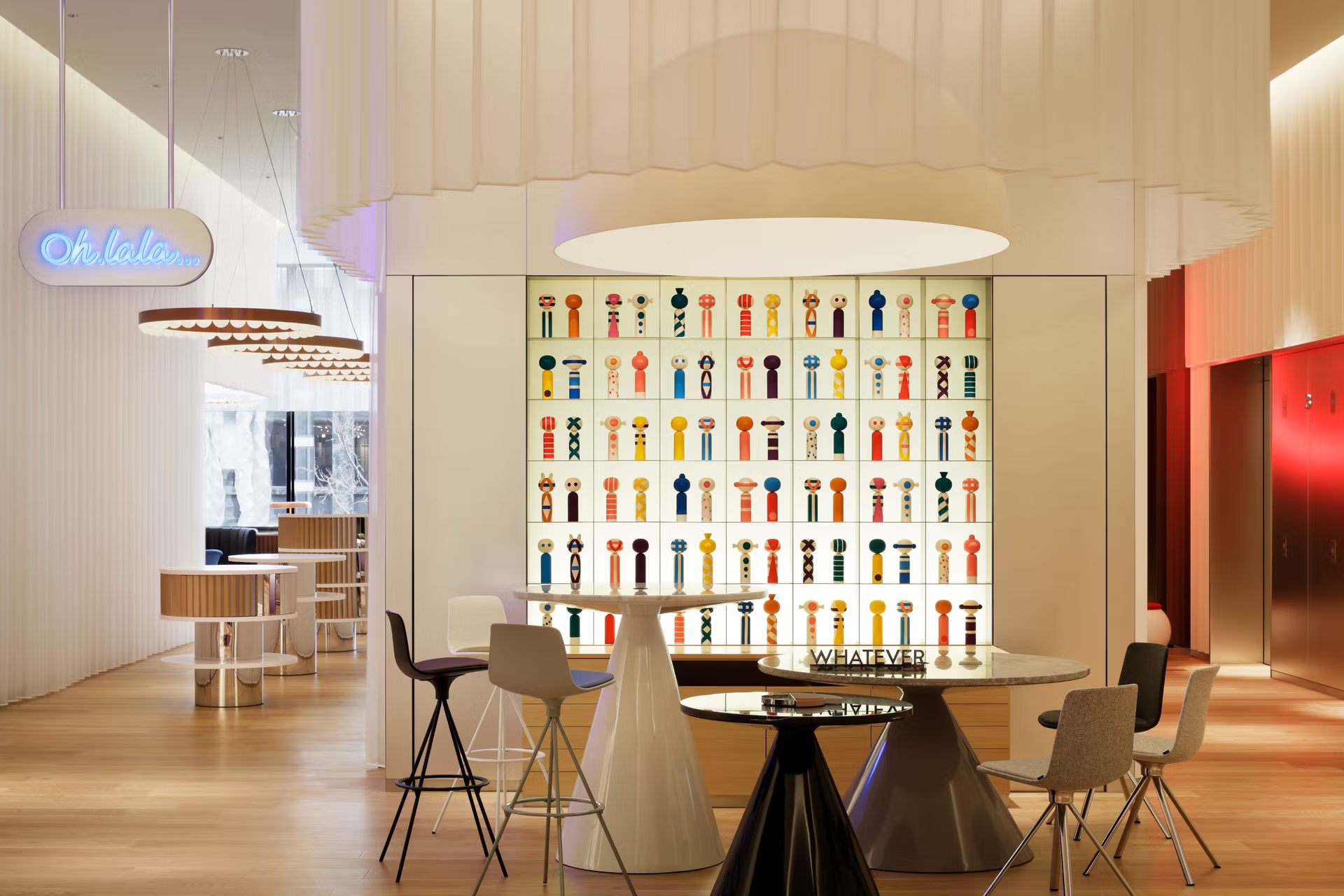
The logo consists of a bright & friendly handwritten font, with the capital O and dots forming perfect circles. The color blue is based on the typical Breton stripe and in line with the colors of the interior design. A neon version is placed at the entrance, inspired by the vibrant streets of Osaka.

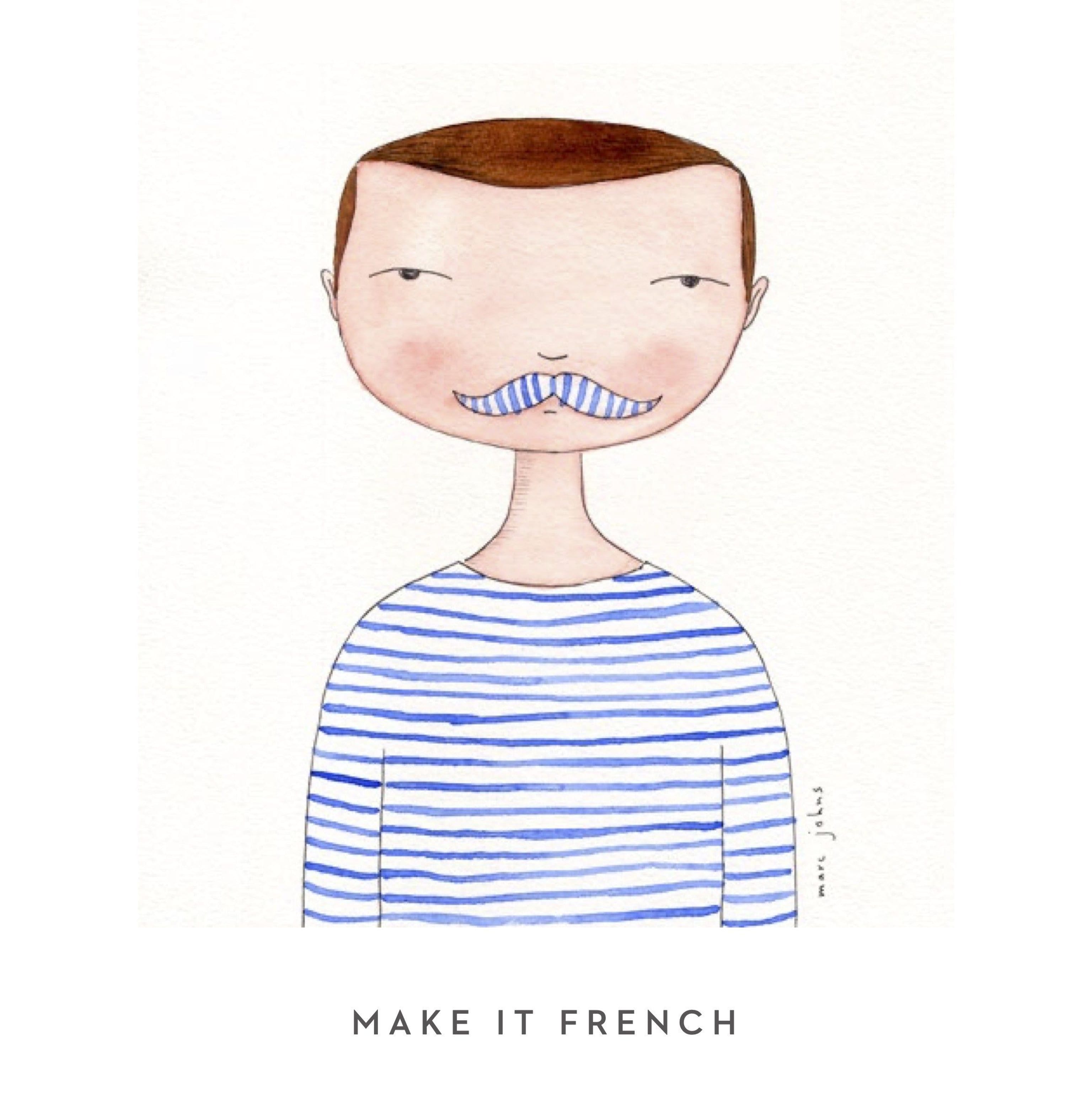
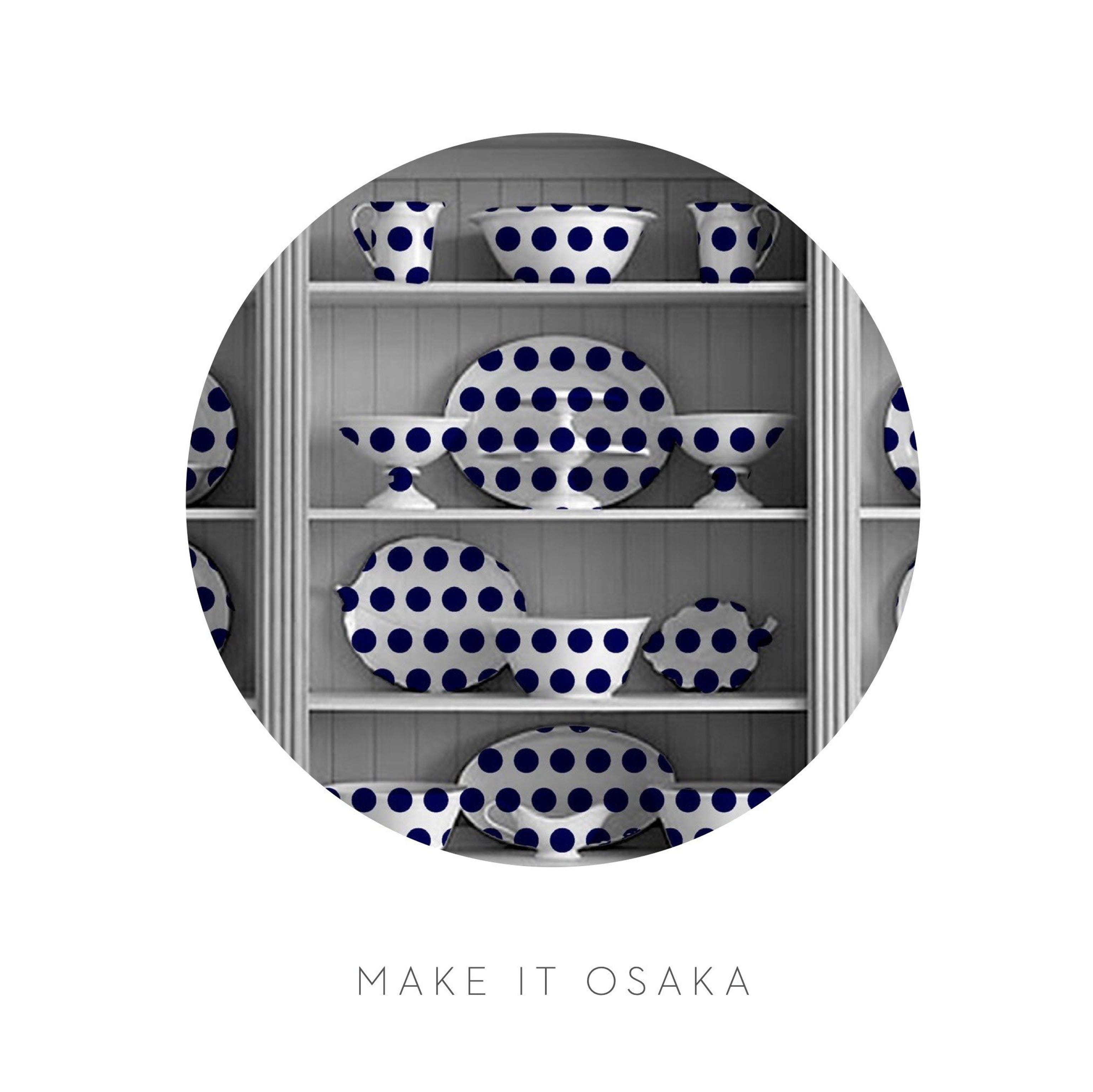

french stripes meet japanese dots
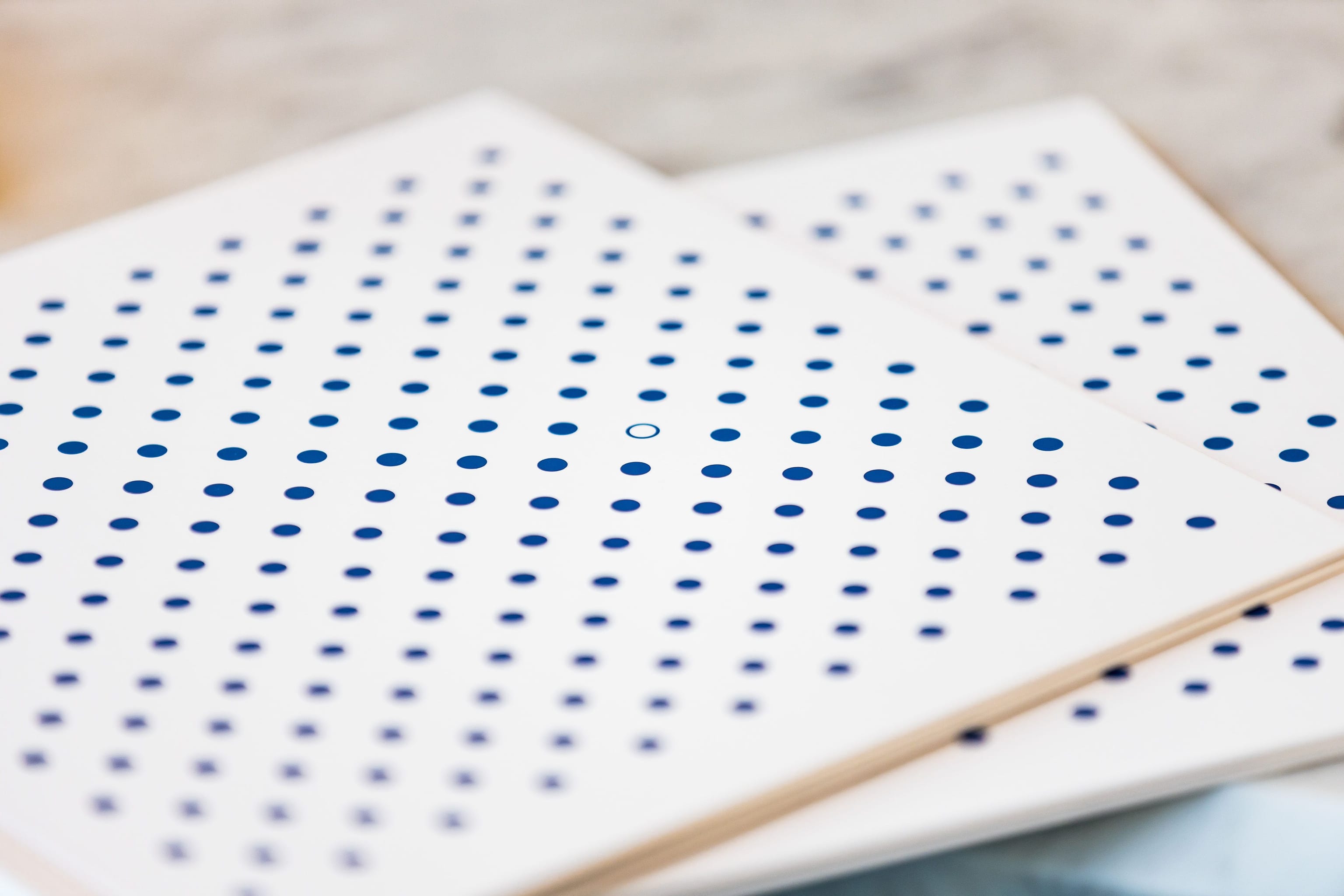
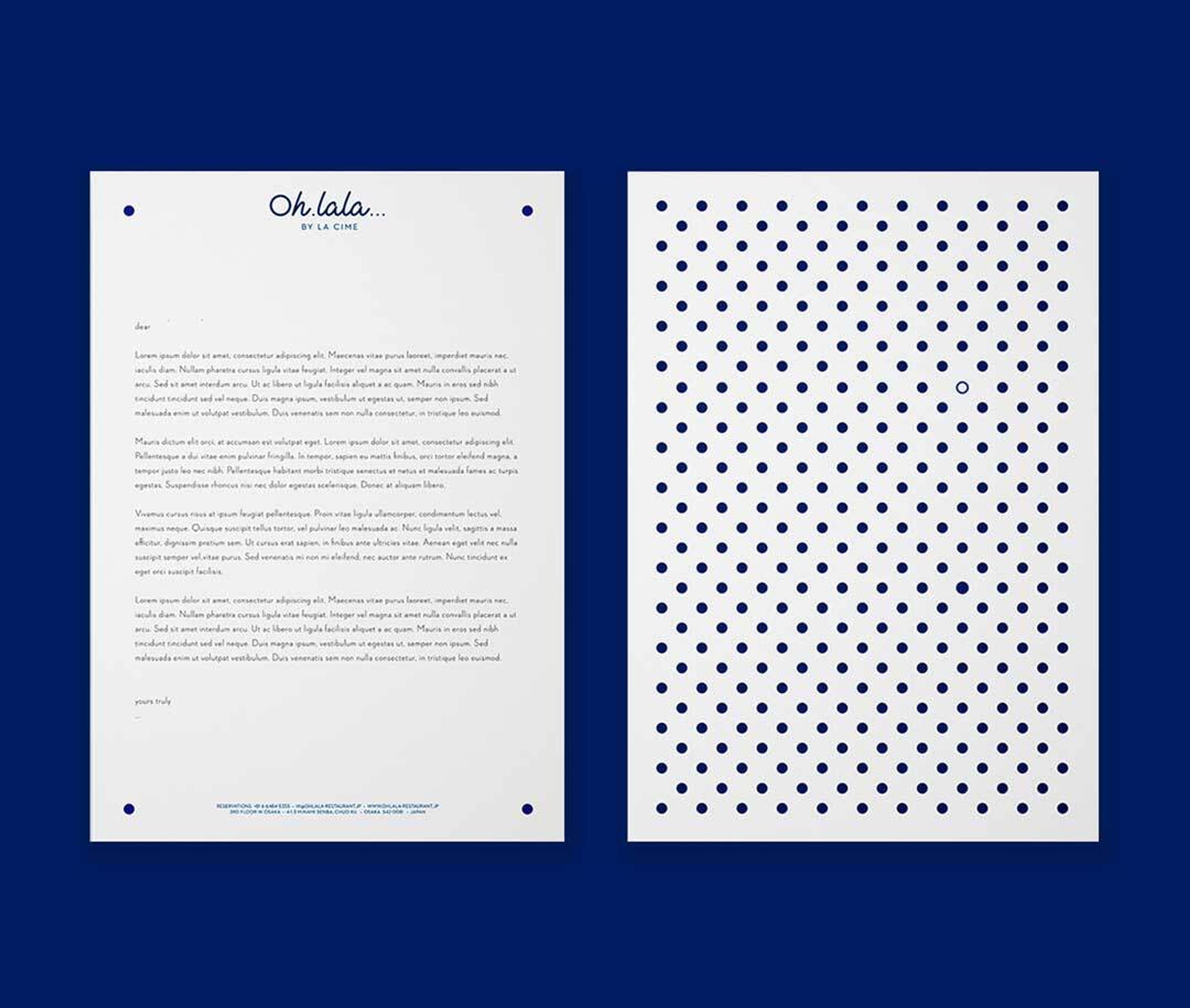
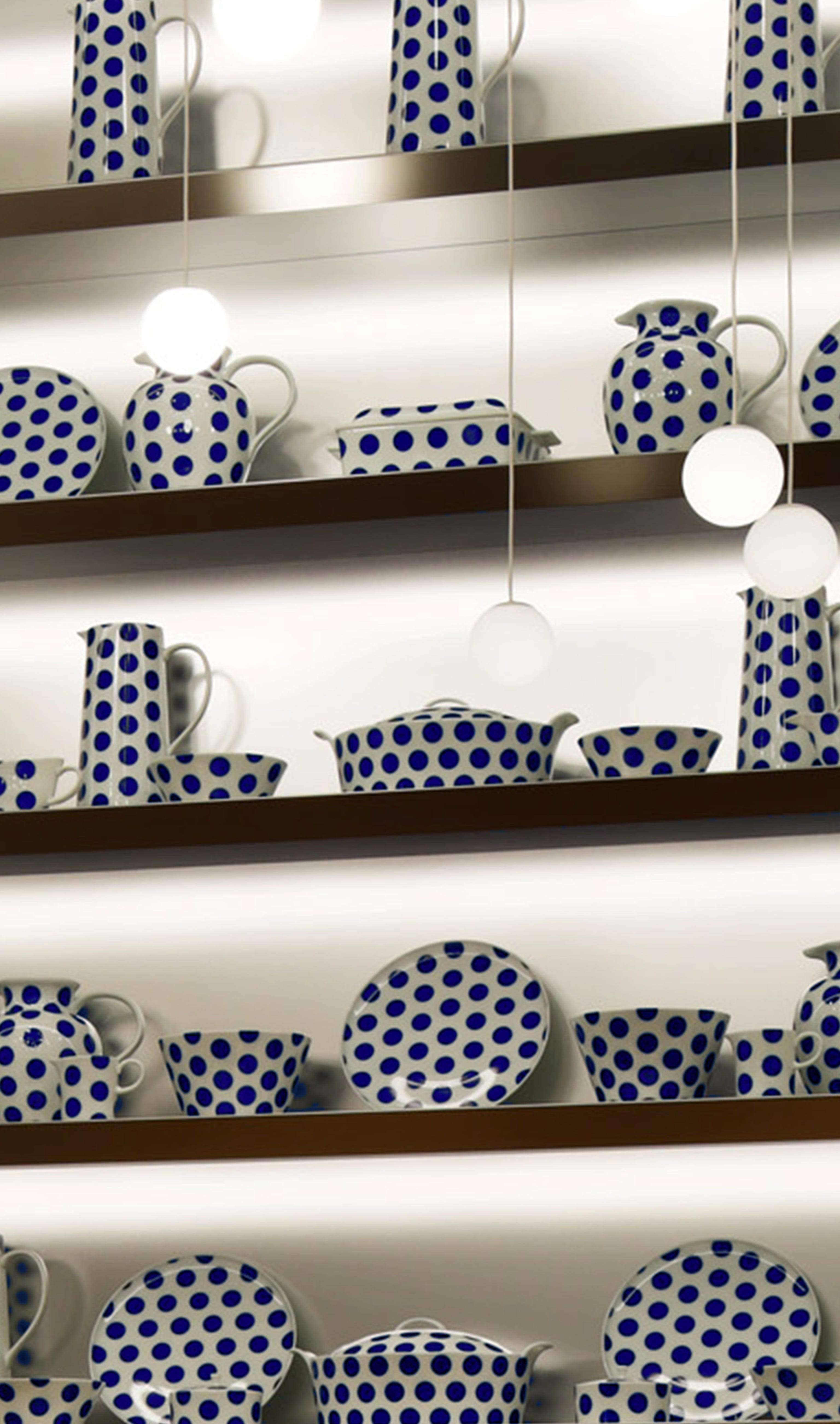
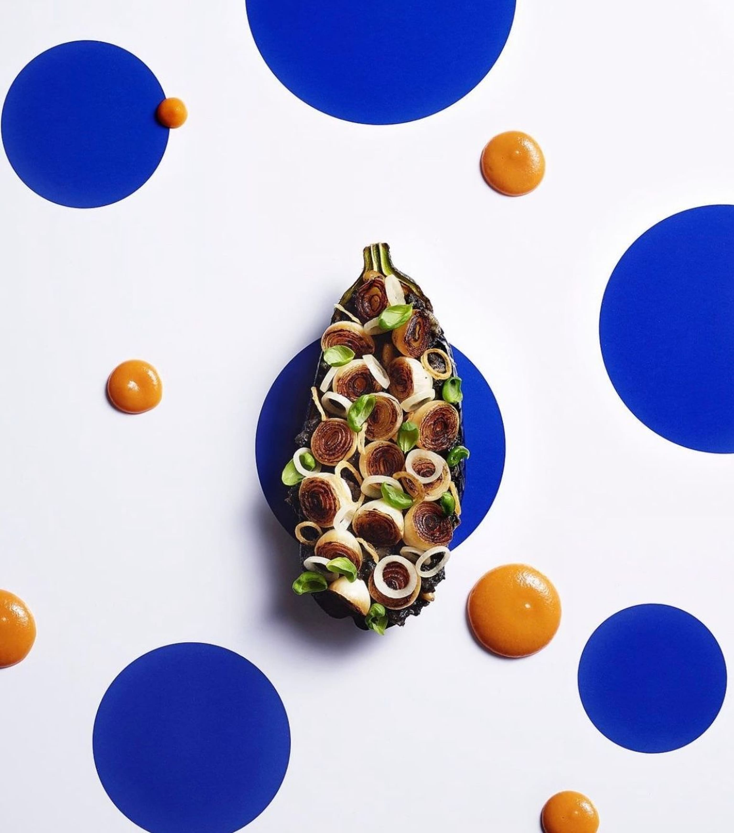
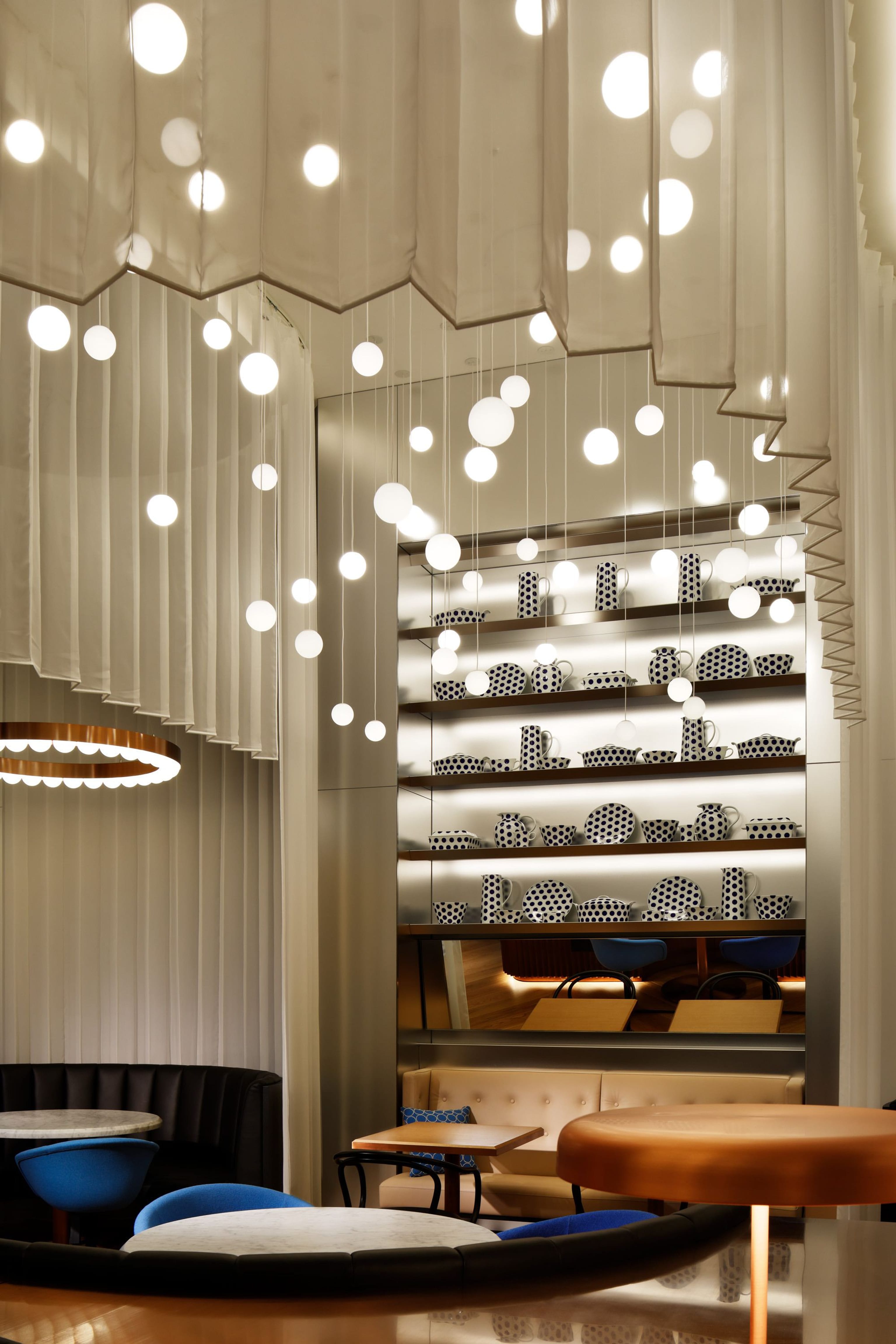
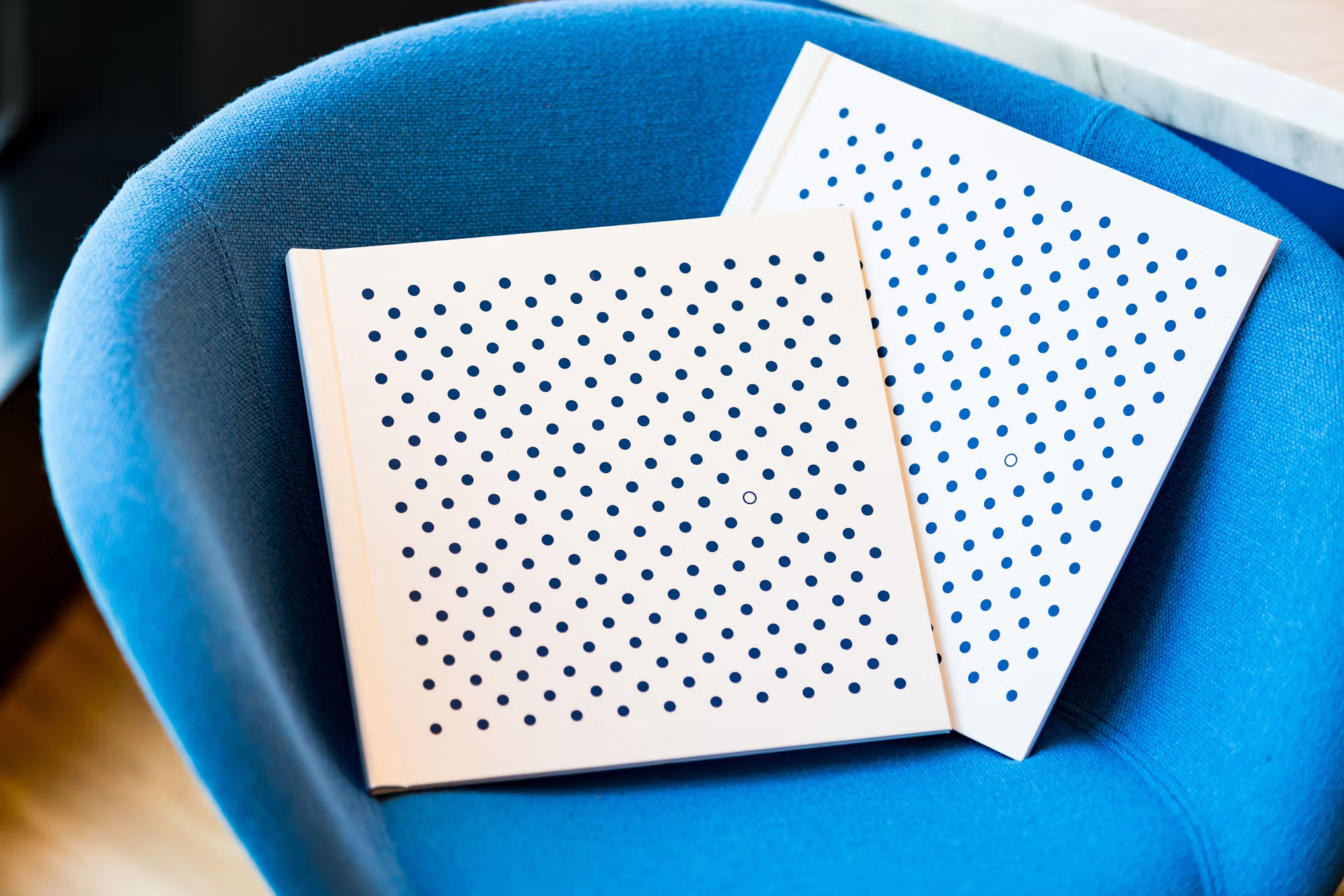
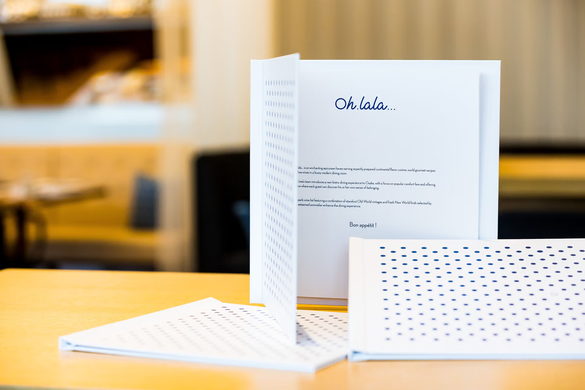
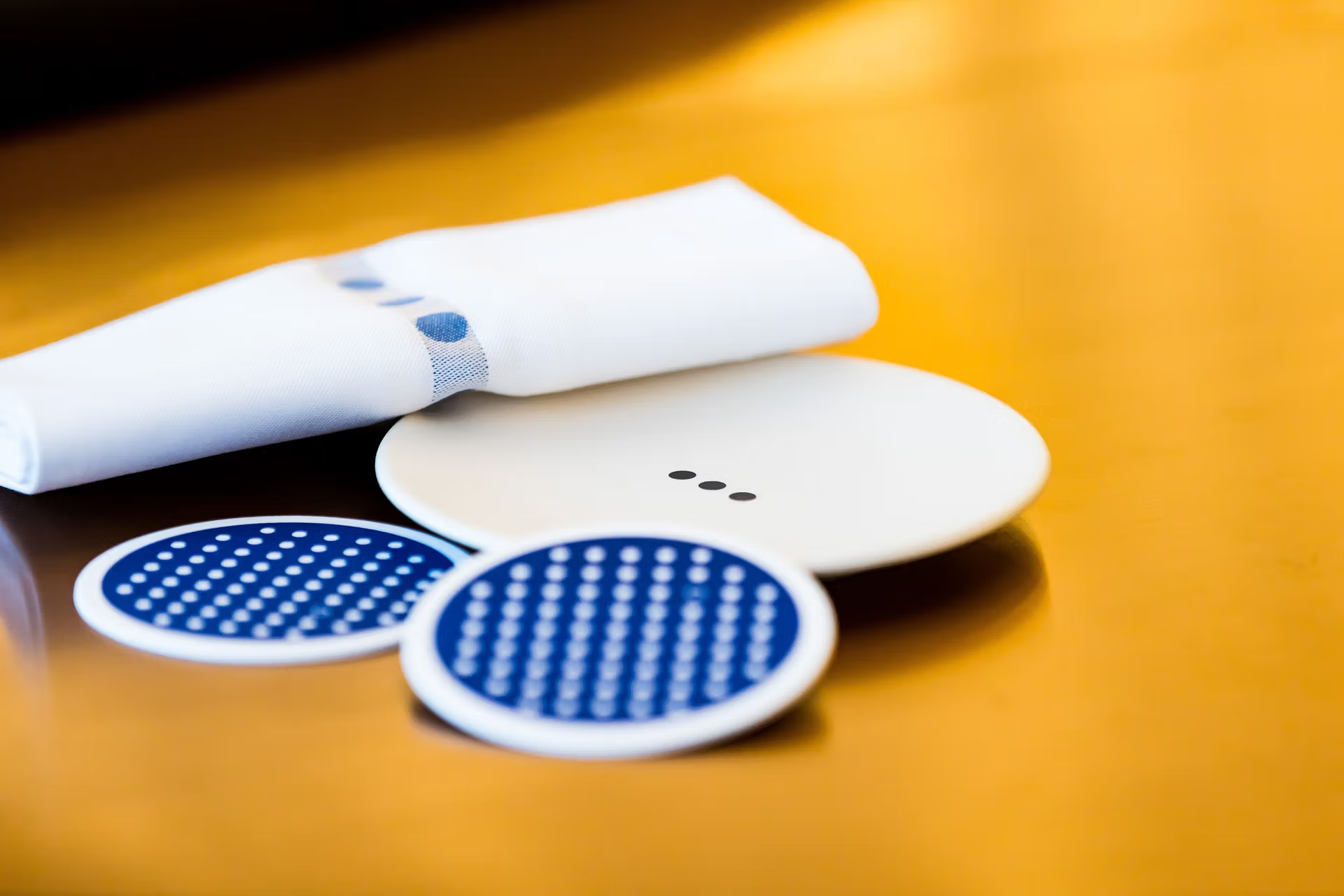
The blue and white stripes of the typical Breton shirt are translated into a pattern of perfect Japanese circles - with one outlined circle adding a touch of playfulness. This Japanese dot pattern forms the base of the graphic design of the restaurant menus, business cards, stationery and coasters. The pattern can also be found on the porcelain styling objects in the cabinets, the staff uniform and table decoration such as napkins.